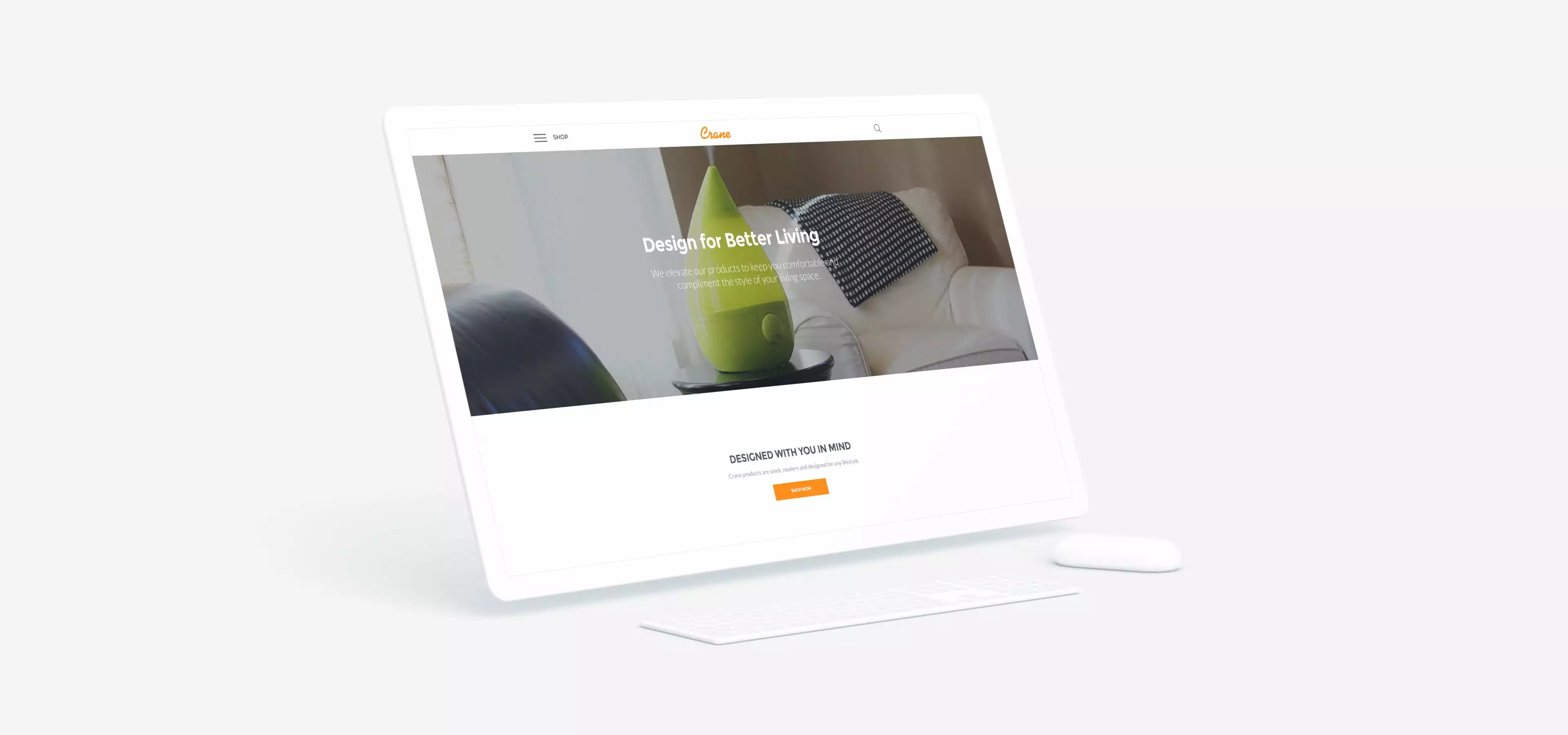
CONSUMER PRODUCT CRANE

CRANE
Crane had a brand identity and story in place, along with product photography. Now, they needed an e-commerce experience to share their story and product line with the world. Mabbly readily took on the challenge presented. We began by examining how customers currently perceived and interacted with the Crane brand. To create actionable insights, Mabbly data scientists analyzed all aspects of the digital channel, including keyword research, market opportunities, traffic sources, and qualitative interviews with Crane’s sales associates and current customers. From there, our creative team developed a data-backed creative vision, and soon development was underway.
Objective
Crane had a strong hold on the retail market and looked to Mabbly to grow their direct e-commerce sales. Mabbly was tasked with reimagining their digital presence, from strategy to design to front and backend development.


Outcome
Mabbly successfully developed a consumer experience focused on their emotional, functional, and technical needs, which grew Crane’s direct online conversions significantly upon launch. Our results included a 164% increase in average transaction per order and 136% increase in e-commerce conversions.


New Product &
Site Architecture
Once we developed strong user profiles to overcome the confusion presented by the current vast product offering, our analytics studio discovered obstacles for the user to self-identify and find their section of the site. To solve this, we developed a multifaceted structure for various SKUs, sub-brands, and technologies. Once the UI/UX structure was developed to allow users to easily find, learn, and buy the products they wanted, Mabbly implemented proven purchasing user flows to drive sales.


